Progress-bar uploader
The Progress Bar Uploader (opens in a new tab) is designed for larger files whose upload will take more than a few seconds. It provides visual feedback of upload progress in the form of a progress bar.
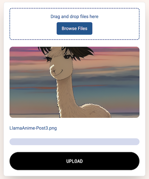
Uploading
The component uses a lazy funding approach, it first determines the cost to upload the chosen file, then checks the user's loaded balance, only funding more if needed. Once uploaded, a link to the file is shown in the UI and stored in the fileUrl state variable.
Customizing the UI
In default mode, the ProgressBarUploader component shows both the image preview and receipt preview buttons. They can be hidden by passing config parameters.
| Description | Code |
|---|---|
| Default Behavior | <ProgressBarUploader /> |
| Hide the image preview | <ProgressBarUploader showImageView={ false } /> |
| Hide the receipt preview | <ProgressBarUploader showReceiptView={ false } /> |
Code
The component is designed to be used as-is. Users making significant changes to the UI will need to understand the following.
The progress bar uploader uses our chunked uploader, which gives users fine-grained control over how files are uploaded. You can specify how to break a large file into smaller "chunks", how big each should be and how many should be uploaded at once. The uploader also supports event callbacks which update you on the upload's progress.
The progress bar is controlled using the progress state variable, as its value is incrementally updated from 0 to 100, the visual representation automatically updates.
const [progress, setProgress] = useState<number>(0);Using the chunked uploader
When setting up the chunked uploader, configure it by setting the batch size and chunk size. You may need to experiment with these values as you build your application, the ideal configuration will depend on factors including average file size and the quality of your end-user's internet connection.
const irys = await getIrys();

const uploader = irys.uploader.chunkedUploader;
uploader.setBatchSize(1);
uploader.setChunkSize(2000000);
Event callbacks
Three different event callbacks are supported, use them to have code run during and after your upload. Currently they are used to update the progress bar.
chunkUpload: Called after each chunk is uploaded, updates the progress bar.
uploader.on("chunkUpload", (chunkInfo) => {
	const chunkNumber = chunkInfo.id + 1;
	// update the progress bar based on how much has been uploaded
	if (chunkNumber >= totalChunks) setProgress(100);
	else setProgress((chunkNumber / totalChunks.current) * 100);
});error: Called if an error happens. In most cases, these can be ignored as the uploader automatically retries the upload whenever an error happens.
uploader.on("chunkError", (e) => {
	console.error(`Error uploading chunk number ${e.id} - ${e.res.statusText}`);
});done: Called when the upload is complete, sets the progress bar to 100%.
uploader.on("done", (finishRes) => {
	console.log(`Upload completed with ID ${finishRes.id}`);
	// Set the progress bar to 100
	setProgress(100);
});
Uploading the file
Once the event callbacks are setup, the file is passed to the uploader and the URL to the file is shown in the UI and stored in a state variable.
await uploader
	.uploadData(dataStream, {
		tags: [{ name: "Content-Type", value: fileType }],
		upload: { getReceiptSignature: true },
	})
	.then((res) => {
		setFileUrl(`https://gateway.irys.xyz/${res.data.id}`);
		setMessage(
			`File <a class="underline" target="_blank" href="https://gateway.irys.xyz/${res.data.id}">uploaded</a>`,
		);
	})
	.catch((e) => {
		setMessage("Upload error " + e.message);
	});